
Colors in workspace design influence your mood and productivity by triggering psychological responses. Blue helps you stay focused and calm, reducing stress, while green promotes balance and well-being. Yellow energizes your creativity and optimism, and red can boost motivation but should be used carefully. Neutral tones support concentration, and accent colors can further shape the environment’s vibe. To create an effective workspace, understanding these effects can guide your color choices—discover how to optimize your space further.
Key Takeaways
- Color choices like blue and green promote focus, calmness, and emotional balance in workspace environments.
- Incorporating energizing colors such as yellow and red can boost creativity, motivation, and productivity.
- Neutral tones help reduce visual noise, enhance concentration, and create flexible, adaptable workspaces.
- Cultural and contextual considerations are essential, as color symbolism varies across different cultures and environments.
- Strategic use of accent colors influences mood, behavior, and overall psychological well-being in the workplace.
The Impact of Blue on Focus and Calmness

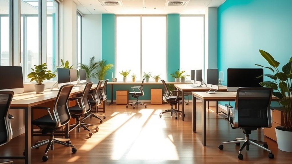
Blue is often associated with calmness and focus, making it a popular choice for workspace design. In color therapy, blue helps reduce stress and promote mental clarity, creating an environment conducive to concentration. When you incorporate blue into your workspace, you foster harmony, which can improve productivity and reduce distractions. The soothing qualities of blue help calm the mind, allowing you to stay engaged without feeling overwhelmed. By choosing shades of blue, you’re actively supporting a balanced atmosphere where focus and tranquility coexist. This intentional use of color enhances overall workspace harmony, making it easier to stay task-oriented while feeling relaxed. Incorporating blue isn’t just about aesthetics—it’s about creating a space that nurtures your mental well-being and efficiency. Additionally, selecting the right colors for workspace design can further optimize the environment for productivity and mental health.
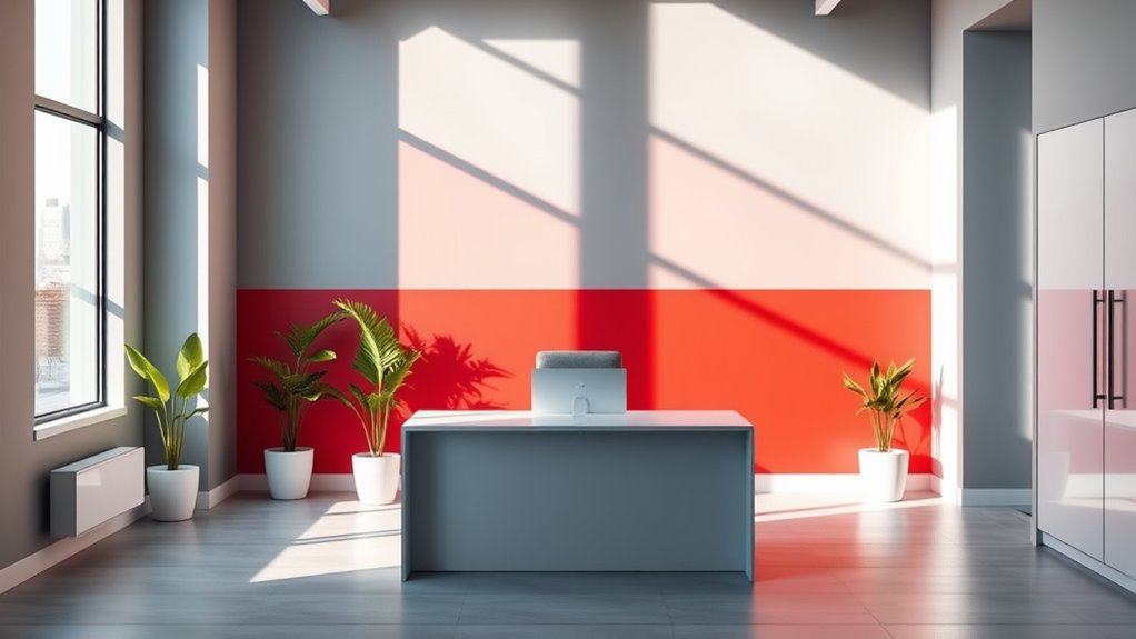
Red’s Role in Stimulating Energy and Urgency
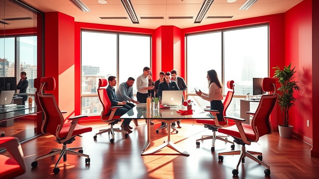
Red can boost your motivation and sharpen your focus when used in workspace design. It encourages action and keeps you alert during busy tasks. Incorporating red strategically can create a sense of urgency that drives productivity. For example, using red in areas where quick decision-making is essential can enhance support hours awareness and improve overall efficiency.
Enhances Motivation and Focus
When you incorporate red into your workspace, it naturally boosts motivation and sharpens focus by stimulating energy and creating a sense of urgency. The color symbolism of red is often linked to excitement, passion, and action, which can elevate your drive to complete tasks. Cultural interpretations further influence how red impacts you; in some cultures, it signifies prosperity and power, enhancing confidence and determination. This energetic hue encourages you to stay alert and engaged, making it an effective choice for environments where productivity is key. By harnessing red’s psychological effects, you can foster a workspace that motivates you to push forward and maintain concentration, ultimately supporting your ability to work efficiently and with purpose. Additionally, understanding divorce process in various states can help individuals manage significant life changes more effectively during stressful times.
Promotes Action and Alertness
Incorporating red into your workspace actively stimulates your energy levels and creates a sense of urgency that drives immediate action. This effect is rooted in color therapy, which suggests red boosts alertness and motivation. When used strategically, red can enhance workspace productivity by encouraging faster decision-making and increased focus. However, too much red may induce stress, so balance is key. Consider adding small red accents or accessories rather than painting entire walls. Use the table below to understand red’s impact:
| Red’s Effect | Benefit |
|---|---|
| Stimulates Energy | Keeps you alert and active |
| Creates Urgency | Promotes quick task completion |
| Enhances Motivation | Inspires action and initiative |
| Risks of Overuse | May cause stress or agitation |
| Optimal Use | Small accents for balanced stimulation |
Additionally, understanding color psychology can help you make informed choices about where and how to incorporate red for maximum benefit without overwhelming the space.
Green and Its Connection to Balance and Well-Being
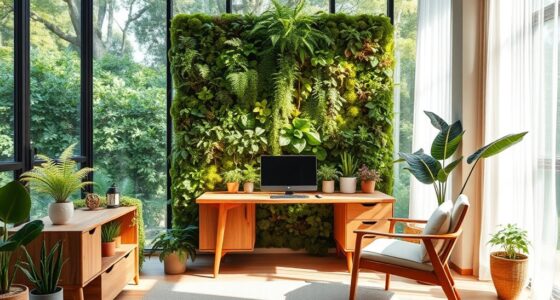
Green is often associated with balance and harmony, making it a powerful color choice for workspace design. It fosters a strong connection to nature, which can help you feel more grounded and centered. When you incorporate green into your environment, it encourages stress reduction, helping you stay calm amid busy workdays. The presence of green can create a soothing atmosphere that promotes well-being and mental clarity. By surrounding yourself with this color, you tap into its natural calming effects, making it easier to focus and recharge. Additionally, green has been linked to emotional health, supporting overall mental wellness. Whether through plants, artwork, or paint, green supports your overall sense of equilibrium and emotional health, contributing to a more balanced and productive workspace.
Yellow and Its Influence on Creativity and Optimism

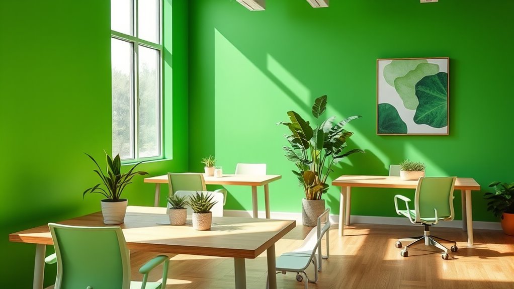
Yellow can energize your workspace by boosting creative thinking and inspiring new ideas. It also helps improve your mood, making you feel more optimistic throughout the day. Incorporating yellow into your environment might just be the key to opening greater innovation and positivity. Additionally, a touch of yellow can stimulate creative spark, encouraging you to explore new concepts and solutions.
Boosts Creative Thinking
Yellow, often associated with sunshine and energy, has a powerful effect on creative thinking in workspace design. Its influence depends on color saturation; a vibrant yellow can stimulate your mind, encouraging innovative ideas, while a softer hue may foster focus. You can boost creativity by incorporating yellow into your workspace personalization, such as through artwork, accessories, or wall accents. This color naturally draws attention and sparks mental activity, making it ideal for brainstorming areas. When used intentionally, yellow helps break mental blocks and energizes your thought process. However, balance is key—too much saturation might cause fatigue, so mixing different shades ensures sustained creative flow. Overall, yellow creates an environment that inspires originality and enhances your ability to think outside the box. Additionally, understanding color psychology can help you select the most effective shades to optimize your workspace environment.
Enhances Positive Mood
Building on yellow’s ability to spark creative thinking, this color also plays a significant role in uplifting your mood and fostering a sense of optimism. The color symbolism of yellow is often associated with happiness, warmth, and energy, which can trigger positive emotional responses. When you incorporate yellow into your workspace, it encourages feelings of cheerfulness and confidence, helping you feel more motivated throughout the day. This vibrant hue stimulates alertness and can reduce feelings of stress or gloom. By promoting an optimistic outlook, yellow creates an environment where you’re more likely to approach tasks with enthusiasm and resilience. Overall, using yellow strategically in your workspace can enhance your emotional well-being and boost your overall positivity. Additionally, understanding color psychology can help you choose the most effective hues to influence your mood and productivity.
Neutral Colors and Their Effect on Concentration and Flexibility

Neutral colors, such as beige, gray, and soft white, are often chosen for workspaces because they promote a calm environment that minimizes distractions. These neutral tones help you stay focused and support your concentration during tasks. They also enhance workspace flexibility, making it easier to adapt the environment for different needs or moods. Incorporating self-watering planters into a workspace with neutral tones can add a touch of nature and promote a serene atmosphere. Consider these benefits: 1. Reduce visual noise, helping you stay attentive. 2. Create a versatile backdrop that complements various accent colors. 3. Encourage a sense of openness, making small spaces feel larger. Choosing neutral tones allows you to design a flexible workspace that adapts to your evolving needs without overwhelming your senses. This approach fosters focus and adaptability, essential for productivity.
The Psychological Effects of Accent Colors in the Workplace
Accent colors in the workplace can markedly influence your mood and behavior, often shaping how you feel and perform throughout the day. However, be aware of color psychology myths that suggest universal effects—these aren’t always accurate. Cultural color interpretations vary, meaning a color associated with calmness in one culture might evoke excitement in another. For example, blue is often linked to trust and productivity, but in some cultures, it can symbolize mourning. Using strategic accent colors can energize or soothe your workspace, but it’s essential to weigh personal and cultural nuances. Relying solely on popular beliefs about color effects can lead to misunderstandings. Instead, tailor your color choices based on your environment and cultural context to create a workspace that truly supports your well-being and productivity. Recognizing the cultural significance of colors can help you make more informed and effective design decisions.
Practical Tips for Applying Color Psychology to Your Workspace

To effectively incorporate color psychology into your workspace, start by identifying the primary activities and the mood you want to foster. Consider how color harmony can support productivity and well-being, ensuring your chosen palette promotes focus or relaxation. Keep ergonomic considerations in mind—colors should enhance comfort without causing visual fatigue. Here are practical tips:
- Use calming hues like blues or greens in areas where concentration is key.
- Incorporate energizing colors like yellows or oranges in collaborative or creative zones.
- Balance bold colors with neutral tones to maintain color harmony and prevent overstimulation.
Frequently Asked Questions
How Do Personal Preferences Influence Color Choices in Workspace Design?
Your personal preferences play a big role in choosing workspace colors because they reflect your personality and comfort level. When you select colors that you love, it creates a sense of harmony and makes you more motivated. Trust your instincts to find a color harmony that feels right for you. This personalized approach helps you feel more at ease and boosts your productivity in your workspace.
Can Color Psychology Impact Employee Productivity Beyond Visual Effects?
Color psychology can substantially impact your employee productivity beyond just visual effects. By understanding color symbolism, you can influence mood regulation, helping create an environment that boosts focus, creativity, and motivation. For example, blue promotes calmness and concentration, while yellow energizes and inspires. When you strategically use these colors, you shape a workspace that enhances overall performance and well-being, making productivity improvements more sustainable and meaningful.
Are There Cultural Differences in Color Perception in Work Environments?
Imagine colors as a universal language, yet regional preferences and cultural symbolism paint unique meanings across the globe. You’ll find that what energizes one workspace might evoke calmness elsewhere. Cultural differences influence color perception, shaping how employees interpret their environment. You need to contemplate these nuances, adapting workspace hues to resonate locally, ensuring your design communicates the right message and fosters comfort, no matter where your team is based.
How Does Lighting Interact With Color to Affect Workspace Mood?
You notice that lighting contrast and ambient illumination play a big role in shaping workspace mood. Bright, well-balanced lighting enhances the perception of colors, making the environment feel lively or calm depending on the setup. When you use softer ambient lighting with subtle contrast, it creates a relaxing atmosphere. Conversely, high contrast lighting energizes your space. Adjusting these elements allows you to influence how colors impact your mood and productivity.
What Are the Long-Term Psychological Effects of Specific Workspace Colors?
Imagine you’re in a vintage speakeasy, feeling relaxed and inspired—that’s the power of color association. Long-term, specific workspace colors shape your emotional response, influencing stress levels, motivation, and productivity. For example, blue fosters calmness, while red sparks energy. These psychological effects can last months or years, impacting your overall well-being and work performance. Choosing the right colors can create a healthy, motivating environment that supports your success over time.
Conclusion
By choosing your workspace colors wisely, you can create an environment that energizes, calms, and inspires you—like a gentle breeze on a hot day. When you understand color psychology, you hold the key to transforming your space into a haven of focus and creativity. So, experiment with hues that resonate with your goals, and watch your productivity bloom like a vibrant garden in full sunlight. Your perfect workspace is just a few color choices away.