
Bad dashboards lead to poor decisions because confusing visuals and cluttered data hide key insights, making it easy to misinterpret information. When dashboards are complicated or misleading, you may rely on false impressions or overlook critical details. This can cause you to act on inaccurate assumptions or miss important trends. If you want to avoid these pitfalls and make better, informed choices, understanding how to improve dashboard design is essential—there’s more to discover that can help you succeed.
Key Takeaways
- Cluttered or misleading visualizations distort data, leading to incorrect conclusions and poor decision-making.
- Lack of focus and clarity causes information overload, distracting users from critical insights.
- Poorly designed dashboards reduce user engagement, limiting exploration and understanding of key data patterns.
- Inconsistent styles and excessive metrics hinder prioritization, resulting in analysis paralysis.
- Ineffective dashboards impair communication, prompting reliance on assumptions and superficial insights.
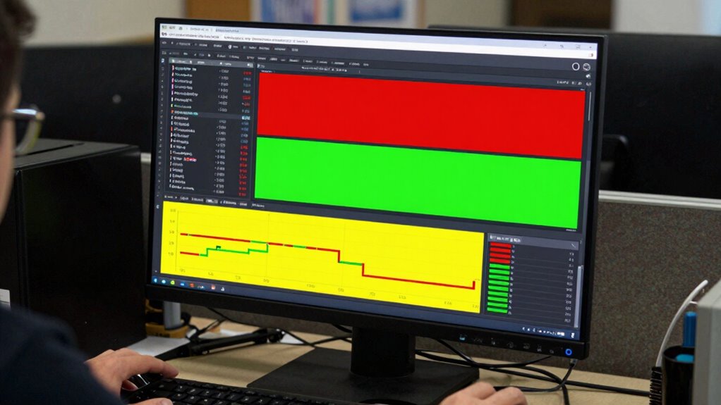
Dashboards are powerful tools for decision-making, but when they’re poorly designed or misused, they can lead you astray. At their core, dashboards rely on data visualization to present complex information quickly and clearly. When done right, they help you identify trends, spot issues, and make informed choices. But if the visualizations are cluttered, confusing, or misleading, they can obscure the truth instead of revealing it. Poor data visualization can distort the story the data wants to tell, leading you to draw incorrect conclusions. For example, overly complicated charts or inappropriate graph types can hide important details or make patterns seem more significant than they really are. This misrepresentation nudges you toward decisions based on false impressions, which can have serious consequences.
User engagement is another critical factor. An effective dashboard not only displays data but also encourages interaction and exploration. If your dashboard is dull, hard to navigate, or lacks clarity, you’ll be less inclined to delve deeper into the information. When user engagement is low, you miss out on opportunities to uncover insights that could improve outcomes. Conversely, a well-designed dashboard invites you to explore data points, compare metrics, and drill down into details. This active engagement helps you understand the underlying causes behind the numbers, rather than just reacting to surface-level trends. Without this interaction, decisions become superficial, based on incomplete or misunderstood data.
Bad dashboards often suffer from a lack of focus and clarity. They pile on too many metrics or use inconsistent visual styles, making it difficult for you to prioritize what’s important. When you’re overwhelmed by data or distracted by unnecessary details, your brain struggles to process and interpret the information effectively. The result? You might chase after irrelevant metrics, overlook critical signals, or become paralyzed by analysis paralysis. This information overload hampers your ability to make timely, accurate decisions. Additionally, ineffective data visualization can further distort your understanding and lead to misguided actions. A clear understanding of data visualization principles can help prevent these issues and improve dashboard effectiveness. Moreover, incorporating relevant metrics ensures that the most impactful data is highlighted, supporting better decision-making. Understanding the importance of visual hierarchy can also guide you in designing dashboards that emphasize the most critical information, reducing cognitive load and enhancing clarity.
Inadequate data visualization and poor user engagement are intertwined causes of bad dashboards that lead to bad decisions. If your dashboards don’t communicate data clearly or fail to motivate you to explore further, you’re more likely to act on assumptions or incomplete insights. To avoid this, focus on creating streamlined, visually effective dashboards that invite interaction, clarify key metrics, and tell a compelling story with your data. Recognizing the role of effective data storytelling can significantly boost your ability to interpret and utilize data meaningfully. When you do, you’ll be better equipped to make decisions rooted in understanding rather than guesswork.

Data Visualization with Excel Dashboards and Reports
As an affiliate, we earn on qualifying purchases.
As an affiliate, we earn on qualifying purchases.
Frequently Asked Questions
How Can Organizations Identify a Poorly Designed Dashboard?
You can identify a poorly designed dashboard by evaluating its data visualization clarity and user engagement. If the visuals are cluttered, confusing, or misrepresent data, it’s a sign of poor design. Additionally, if users find it difficult to navigate or ignore the dashboard altogether, engagement is low. A good dashboard should be intuitive, highlight key insights, and encourage users to interact with the data confidently, indicating effective design.
What Are Common Signs of an Ineffective Dashboard?
You’ll notice an ineffective dashboard if data visualization feels cluttered or confusing, making it hard to interpret key metrics quickly. Low user engagement signals that users might find it unhelpful or hard to navigate. If the dashboard doesn’t highlight important insights or overwhelms you with unnecessary details, it’s a clear sign it needs improvement. Effective dashboards boost user engagement by presenting clear, relevant data that supports informed decision-making.
How Do Bad Dashboards Impact Overall Business Performance?
You might think bad dashboards only cause confusion, but they actually hurt your business performance more. Poor data accuracy and visual clarity lead to misinterpreted insights, causing you to make wrong decisions. When dashboards are cluttered or unreliable, you waste time and resources chasing false trends. This ultimately hampers growth, reduces efficiency, and undermines strategic goals. Ensuring data accuracy and visual clarity is essential to making informed, impactful decisions that drive success.
Can a Bad Dashboard Be Improved or Fixed Easily?
Yes, a bad dashboard can be improved or fixed easily if you focus on dashboard aesthetics and data accuracy. Start by simplifying the design to make it more visually appealing and easier to interpret. Guarantee the data presented is accurate and up-to-date, which builds trust. Regularly review and update the dashboard to align with your evolving needs. These steps make it more effective and help you make better decisions.
What Role Does User Feedback Play in Dashboard Design?
You might be surprised, but user feedback plays a vital role in dashboard design. It reveals your actual user preferences and highlights what’s confusing or useless. Ignoring this input risks creating dashboards that break design principles and mislead decision-makers. When you incorporate user insights, you guarantee the dashboard aligns with their needs, making it more intuitive, effective, and capable of guiding sound decisions—so don’t underestimate its power.

Building Interactive Business Intelligence Dashboards with Google Looker: Beginner’s Practical Book
As an affiliate, we earn on qualifying purchases.
As an affiliate, we earn on qualifying purchases.
Conclusion
Remember, a poorly designed dashboard can steer you wrong, leading to decisions that aren’t just flawed but costly. When data isn’t clear or misleading, you’re flying blind, making choices without the full picture. Don’t let bad dashboards be the Achilles’ heel of your decision-making process. Instead, invest in clarity and accuracy—because if you don’t, you might find yourself barking up the wrong tree, wasting time and resources that could have been saved with better insights.

Information Dashboard Design: Displaying Data for At-a-Glance Monitoring
Used Book in Good Condition
As an affiliate, we earn on qualifying purchases.
As an affiliate, we earn on qualifying purchases.

Effective Data Visualization: The Right Chart for the Right Data
As an affiliate, we earn on qualifying purchases.
As an affiliate, we earn on qualifying purchases.